Your cart is currently empty!
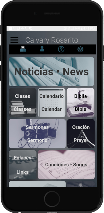
Example Home Page for the App
Presented here is an example “Home” page for your churches App. It has just enough explanation for you to be able to use it and modify it to fit your desires. The example provided is for a bilingual church so your button and menu labels are likely to be simpler.
Your first step is to open the “App Content” from the main WordPress menu, select the Home page, and select “Text” as your editing method from the tabs on the far right. FruinCom recommends the “HTML Editor Syntax Highlighter” so that you can have the benefit of color coding the syntax of your HTML, CSS, and JavaScript code.
NOTE: In order for any of this page to look the same as our example you will also need to use the example CSS Page provided and explained on the “CSS Template for the App” help page.
This church has a background color defined for the whole site in the App CSS page but they have defined a background image for the Home page only. To accomplish this we insert the following lines at the beginning of the file.
the <style> … </style> tags tell the web browser that we have inserted some style information to define the formatting of the “body” of our page.
You will, of course, need to change the url shown in the example to point to your desired background image. If you are using a tiled image the “background-repeat: no-repeat;” will have to be changed to “background-repeat: repeat;” and “background-size: 100% 100vh;” will need to be deleted.
<style>
body {
   background-image: url(https://calvarychapelrosarito.info/wp-content/uploads/2020/08/Background_CloudBillow_final.jpg);
   background-repeat: no-repeat;
   background-position: left top;
   background-attachment: fixed;
   background-size: 100% 100vh;
}
</style>
The next element we see on the page is a black bar with four icons. We call this the tool bar. This is a <div> tag to define the black rectangle and group the icons followed by the defining of four buttons.
3 of these buttons point to built-in elements that are included with the App but one, the question mark, points to a Help page that is an “App Content” page added by the church. Notice that the user added page “ayuda-help” has several differences to the others. This is important. The example below should be followed to avoid problems. Of course you may not need to have any custom “App Content” pages on your app but it is a fantastic feature to have available.
<!-- TOOL BAR -->
<div class="tool-bar">
    <button id="tool-bar-settings-btn" class="tab-button" data-tab="#settings"></button>
    <button id="myButton" class="button tool-bar-help-btn" data-page="ayuda-help"></button>
    <button id="tool-bar-profile-btn" class="tab-button" data-tab="#account"></button>
    <button id="tool-bar-notifications-btn" class="tab-button" data-tab="#messages"></button>
</div>
The remainder of the Home page is a collection of tiled buttons with images as backgrounds or overlaid on the buttons.
Again, we begin with a <div> … </div> tag to serve as a container and to define the section as a tiled arrangement via the CSS class “tiled”.
Most of the magic for this section is found in the details of the CSS page. Other than that, there are, again, two types of button definitions found here. One that references built-in pages and another that references user-added pages that the church has added via “App Content” –> “Add New”.
<div class="tiled">
<button id="news-btn" class="tab-button" data-tab="#news">News</button>
<button id="classes-btn" class="tab-button" data-tab="#classes">Classes</button>
<button id="calendar-btn" class="tab-button" data-tab="#calendar">Calendar</button>
<button id="bible-btn" class="tab-button" data-tab="#bible">Bible</button>
<button id="media-btn" class="tab-button" data-tab="#media">Sermons</button>
<button id="prayer-btn" class="tab-button" data-tab="#prayer">Prayer</button>
<button id="myButton" class="button links-btn" data-page="enlaces-links">Links</button>
<button id="myButton" class="button songbook-btn" data-page="canciones-songs">Songs</button>
<button id="give-btn" class="tab-button" data-tab="#giving">Give</button>
<button id="myButton" class="button pastors-btn" data-page="pastors">Pastors</button>
</div>
News, Classes, Calendar, Bible, Sermons, Prayer, and Give are all built-in and are, therefore, referenced via –
class="tab-button" data-tab="#page-name"Links, Songbook, and Pastors are all user-added “App Content” pages and are referenced via –
class="button songbook-btn" data-page="canciones-songs"Because these are user-added pages the church defined their own CSS classes called links-btn, songbook-btn, and pastors-btn in the App CSS page in order to be able to specify the size, image, etc for those buttons.
<!-- SPANISH -->
<div class="tiled">
<button id="news-btn" class="tab-button" data-tab="#news">Noticias</button>
<button id="classes-btn" class="tab-button" data-tab="#classes">Clases</button>
<button id="calendar-btn" class="tab-button" data-tab="#calendar">Calendario</button>
<button id="bible-btn" class="tab-button" data-tab="#bible">Biblia</button>
<button id="media-btn" class="tab-button" data-tab="#media">Sermones</button>
<button id="prayer-btn" class="tab-button" data-tab="#prayer">Oración</button>
<button id="myButton" class="button links-btn" data-page="enlaces-links">Enlaces</button>
<button id="myButton" class="button songbook-btn" data-page="canciones-songs">Canciones</button>
<button id="give-btn" class="tab-button" data-tab="#giving">Dar</button>
<button id="myButton" class="button pastors-btn" data-page="pastors">Pastores</button>
</div>