CSS Template for the App
Andy Moyle, the author of Church Admin Plugin for WordPress has included a fantastic feature that allows customers to almost completely customize and stylize their churches App experience.
In order to access this ability go to “Church Admin” in the main WordPress Administration menu and select “App” –> “Settings”.
On the App–> Settings page you will see an editable field labeled “App menu CSS”. By adding CSS formatting information in this field we are able to modify the styling of all of the existing CSS elements as well as create as many new, custom css elements as we desire.
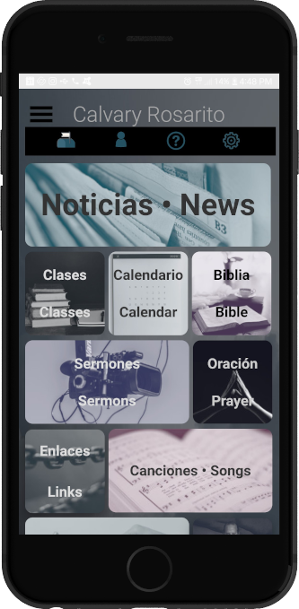
Below FruinCom has provided an example from Calvary Chapel Rosarito to function as a both a template and/or a simple tutorial on what is possible. It MUST be pared with the example found on the “Example Home Page for the App” help page in order to function.
NOTE: If you are new to CSS consider one of the many great and free introductions available online i.e. w3schools.com
Global Elements
The first section in our example defines several variables.
These variables will function as a form of shorthand throughout our styling. It saves us having to type or even remember the color names over and over.
/* STYLE VARIABLES */
/* These variables are referenced throughout this document */
:root {
  --bg: SlateGray;
  --fontDefault:  Tahoma, Helvetica, sans-serif;
  --fontColor: Gainsboro;
}
The next section contains a couple of elements that will have a global affect on the App unless overwritten directly on a page.
/* BODY styles that apply to the whole App (unless specifically overwritten) */
body {
  background: var(--bg);
  height: 100vh;
  font-family: var(--fontDefault);
  color: var(--fontColor);
}

 /* Regular Buttons (GLOBAL) */
.button {
  display: inline-block;
  background-color: #313D48;
  box-shadow: 0 8px 16px 0 rgba(0,0,0,0.2), 0 6px 20px 0 rgba(0,0,0,0.19);
  margin: 4px 0 4px 0;
  border: 1px solid #293A45;
  border-radius: 12px;
  font-size: 24px;
  text-align: center;
  font-weight: bold;
  text-decoration: none;
  color: var(--fontColor);
  opacity: 1.0;
}
The body{} and .button{} selectors each contain several properties and value pairs that show how they should look on the page.
Every declaration within the body{} selector will affect the entire page. Since this external CSS page affects the entire App all pages will be affected by these declarations.
The .button{} selector starts with a . and that shows us that it is defining a “class”. Now that we have assigned style declarations to the .button class any element in the App that has a “class=button” statement included within it will be displayed according to the style we have defined here. It just so happens that this is the “class” that Andy Moyle has used on all of the buttons in the App. So, by specifying what we want .button to look like we have changed the look of every button in the App.
The next section, the “header” (the rectangle at the top of each page) includes the site title (Church Name usually), the page titles, the hamburger menu graphic, and the hamburger menu items.
“header” is the id of the <div> tag that contains the elements you see at the top of each page. Here we make it’s background transparent so that the global “body” background shows through. We set the spacing using “margin” and “padding”. We have hidden the border outline by setting it’s size to 0. Next we set the “font-size”, align the text to the left, and make sure there is no fancy decorations applied to the text. Finally we set the entire <div> rectangle that is the “header” to be 45 pixels tall using the “height” property.
#header {
  background-color: transparent;
  margin: 0;
  padding: 0;
  border: 0;
  font-size: 22px;
  text-align: left;
  text-decoration: none;
  height: 45px;
}
Next we will style the <div> that groups the Church Name or title with the graphic of the hamburger menu. Here, again, we set spacing but now we also have specified the font color and align the text to center.
The opacity is optional but can be used to give the title and the hamburger menu a fade affect as desired.
/* Hamburger Menu and Church Name Block (GLOBAL) */
#menu {
  margin: 0;
  padding: 0;
  border: 0;
  border-radius: 0;
  text-align: center;
  color: var(--fontColor);
  opacity: 1.0;
}
Church Name Label (GLOBAL) that appears at the top of every page in the App is defined by “church” id. Experiment with “font-family”, “font-size”, “font-weight”, “color” (which is font color), and “text-decoration” to create the desired look.
#church {
   display: inline-block;
   position: relative;
   background-color: transparent;
   font-family: var(--fontFamily);
   font-size: 22px;
   font-weight: 300;
   color: var(--fontColor);
   text-align: center;
   text-decoration: none;
}
By defining styles for the <h2> tag (Header size 2) you can style the title of each page except for the home page. This title is the page title displayed just below the header and before the page content.
h2 {
  font-family: var(--fontFamily);
  color: var(--fontColor)
}
The Hamburger Menu is structured as an un-ordered list (<ul> tag in HTML) and each item is defined as a list item (<li> tag in HTML).
By specifying the <ul> tag combined with the .menu class we can set the style of the Menu without affecting other unordered lists that may be present on the App. In like manner we can combine the <li> tag with the .tab-button class so that our style changes only affect the menu items and not every other tab-button on the App.
Notice the commented out section ( /* … */ ) at the end. Uncommenting this CSS code will create a gradient background for the menu items. Adjust the hexadecimal RGB color values in the first linear-gradient statement (linear-gradient(#4e4e4e, #040404) content-box) to change the color range. Adjust the hexadecimal RGB color values in the second linear-gradient statement (linear-gradient(#292929, #010101) border-box) to adjust the color range of the border.
.tab-button {
  display: inline-block;
}

/* Menu Rectangle */
ul.menu {
   display: none;
   z-index: 999;
   width: 99%;
   height: 90%;
   position: absolute;
      top: 96px;
      left: 27px;
   background: #313D48;
   margin: 0;
   padding: 0;
   border: 1px solid #314848;
   border-radius: 12px;
   opacity: 1.0;
}

/* Menu Items - Rows */
li.tab-button {
  margin: .5em;
  border: solid .125em transparent;
  padding: 10px 16px;
  border-radius: 1em;
  color: #DDDDDD;
  text-shadow: 1px 1px var(--c-sh-txt, rgba(0, 0, 0, 0.5));
  font-size: 20px;
  font-weight: normal;
  text-align: justify;
  filter: contrast(0.65);
  transition: .2s ease-out;
  cursor: pointer;
  border-radius: 0.5em;
  box-shadow: inset 0 1px 1px #9c9c9c;
/*  Gradient background option */
/*
  background: radial-gradient(at 0 -15%, rgba(255, 255, 255, 0.07) 87%, rgba(255, 255, 255, 0) 94%) 0 0/95% 99% no-repeat content-box, linear-gradient(#4e4e4e, #040404) content-box, linear-gradient(#292929, #010101) border-box;
*/
}
The styling for the Tool Bar (horizontal bar with four icons) is defined using a .tool-bar class.
The individual icons are styled with a system generated id for the built-in pages or a user-defined class in the case of user added App Content pages (.tool-bar-help-btn).
/* container for the whole bar */
.tool-bar {
  display: flex;
  flex-flow: row wrap;
  justify-content: space-around;
  height: 42px;
  width: 100%;
  background-color: #000000;
  margin: 0;
  padding: 2px 2px;
  font-size: 14px;
}

#tool-bar-notifications-btn {
  display: inline-block;
  background: transparent;
  background-image: url(https://calvarychapelrosarito.info/wp-content/uploads/2020/09/telegram-03.png);
  background-repeat: no-repeat;
  background-size: cover;
  margin: 2px 0 2px 0;
  padding: 0;
  border: 0;
  height: 36px;
  width: 36px;
  opacity: 1.0;
}

#tool-bar-profile-btn {
  display: inline-block;
  background: transparent;
  background-image: url(https://calvarychapelrosarito.info/wp-content/uploads/2020/09/profileicon.png);
  background-repeat: no-repeat;
  background-size: cover;
  margin: 2px 0 2px 0;
  padding: 0;
  border: 0;
  height: 36px;
  width: 36px;
  opacity: 1.0;
}

.tool-bar-help-btn {
  display: inline-block;
  background: transparent;
  background-image: url(https://calvarychapelrosarito.info/wp-content/uploads/2020/09/help.png);
  background-repeat: no-repeat;
  background-size: cover;
/*  background-color: transparent; */
  margin: 2px 0 2px 0;
  padding: 0;
  border: 0;
  height: 36px;
  width: 36px;
  opacity: 1.0;
}

#tool-bar-settings-btn {
  display: inline-block;
  background: transparent;
  background-image: url(https://calvarychapelrosarito.info/wp-content/uploads/2020/09/SettingsIcon.png);
  background-repeat: no-repeat;
  background-size: cover;
  margin: 2px 0 2px 0;
  padding: 0;
  border: 0;
  height: 36px;
  width: 36px;
  opacity: 1.0;
}
The final section is the rectangle buttons arrayed in a grid on the page.
The .tiled class is used for the <div> tag that wraps around all of our buttons. The important style declarations for this <div> are the “display: flex;”, “flex-flow: row-wrap;”, and “justify-content: space-around;”. These three combine to create a grid environment to house the buttons on any display (tablets and phones of different dimension and resolutions).
The “.tiled button” selector is where we define the style declarations that are common to all of the buttons and then we declare the individual details for each button in its own selector i.e. #news-btn{…}. Once again we see that the built-in pages are referenced via id’s (#news-btn) and the user added App Content pages are referenced via classes (.links-btn). In each case we define the same style declarations; the background image to use, how wide the tile/button should be, how large the label font should be, and what color the label should be.
/* TILED LAYOUT */
.tiled {
  display: flex;
  flex-flow: row wrap;
  justify-content: space-around;
  width: 100%;
  background-color: transparent;
  margin: 0;
  padding: 0;
  font-size: 20px;
}

/* RECTANGLE BUTTONS IN THE TILED LAYOUT */
.tiled button {
  background-repeat: no-repeat;
  background-size: cover;
  background-position: center;
  overflow: hidden;
  border: 0;
  height: 132px;
  text-align: center;
  text-decoration: none;
  margin: 4px 0 4px 0;
  border-radius: 12px;
}

/* INDIVIDUAL BUTTON SPECIFICS */

#news-btn {
  background-image: url(https://calvarychapelrosarito.info/wp-content/uploads/2020/09/11News.jpg);
  width: 99%;
  font-size: 2.5rem;
  color: #000000;
}

#classes-btn {
  background-image: url(https://calvarychapelrosarito.info/wp-content/uploads/2020/09/Classes2-1.jpg);
  width: 32.0%;
  font-size: 1.25rem;
  color: #FFFFFF;
}

#calendar-btn {
  background-image: url(https://calvarychapelrosarito.info/wp-content/uploads/2020/09/Calendar5.jpg);
  width: 32.0%;
  font-size: .9rem;
  color: #000000;
}

#bible-btn {
  background-image: url(https://calvarychapelrosarito.info/wp-content/uploads/2020/09/BIbleReading1.jpg);
  width: 32.0%;
  font-size: 1.5rem;
  color: #000000;
}

#media-btn {
  background-image: url(https://calvarychapelrosarito.info/wp-content/uploads/2020/09/5Sermons-1.jpg);
  width: 66%;
  font-size: 2rem;
  color: #DDDDDD;
}

#prayer-btn {
  background-image: url(https://calvarychapelrosarito.info/wp-content/uploads/2020/09/6Prayer2.jpg);
  width: 32.0%;
  font-size: 1.2rem;
  color: #CCCCCC;
}

.links-btn {
  background-image: url(https://calvarychapelrosarito.info/wp-content/uploads/2020/09/Links1.jpg);
  width: 32%;
  font-size: 1.25rem;
 color: #DDDDDD;
}

.songbook-btn {
  background-image: url(https://calvarychapelrosarito.info/wp-content/uploads/2020/09/Songbook2.jpg);
  width: 66.0%;
  font-size: 1.8rem;
  color: #333333;
}

#give-btn {
  background-image: url(https://calvarychapelrosarito.info/wp-content/uploads/2020/09/Give1.jpg);
  width: 66%;
  font-size: 3rem;
  color: #333333;
}

.pastors-btn {
  background-image: url(https://calvarychapelrosarito.info/wp-content/uploads/2020/09/6pastors.jpg);
  width: 32.0%;
  font-size: 1.1rem;
  color: #ffffff;
}
That’s it. Good luck. Have fun. Try new things!